Teaching Statistics Without Losing Students
The moment I lose them is always the same.
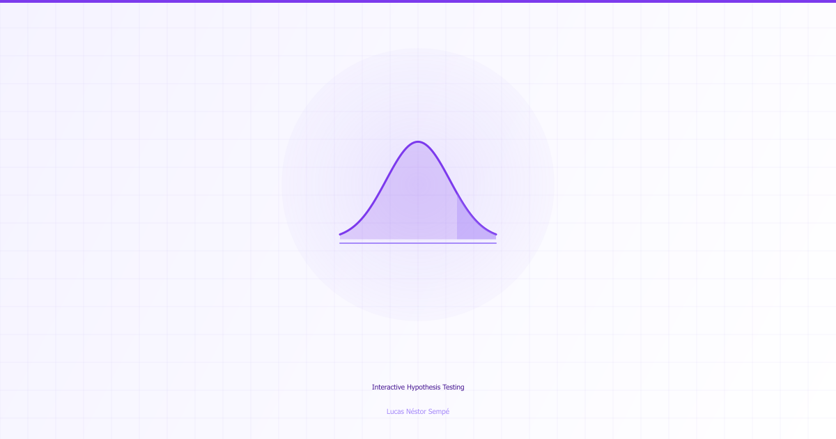
I’m explaining hypothesis testing to a group of program officers. We’ve covered the basics—what a null hypothesis means, why we start from skepticism. They’re following along. Then I draw the 2×2 decision matrix on the whiteboard. “Now, Type I error is alpha, that’s when we reject a true null. Type II is beta, that’s when we fail to reject a false null. Power is one minus beta…”
By the time I finish the sentence, half the room has that glazed look. The matrix has too many cells. The terminology is too dense. They’re trying to hold four concepts simultaneously while I keep adding more.
The problem isn’t intelligence—these are smart people making consequential decisions about development programs. The problem is cognitive load. I’m violating every principle of instructional design by presenting a complex structure all at once.
So I built something that reveals the matrix one quadrant at a time.
Progressive Disclosure
The pedagogical principle is called progressive disclosure. Instead of dumping information, you scaffold it—introduce one concept, let it land, then build the next layer. Each stage should feel manageable, even if the complete picture is complex.
For hypothesis testing, the natural sequence is:
Start with the null hypothesis alone. “We assume no difference until proven otherwise.” This is the foundation. Spend time here. Make sure everyone understands that we begin from skepticism, not belief.
Then show correct decisions. When groups actually are equal and we correctly conclude no effect—that’s a true negative. When groups actually differ and we correctly detect it—that’s a true positive. These are intuitive. People understand what it means to be right.
Then introduce errors. A false positive—detecting an effect that isn’t real—is Type I error. We control this with alpha, typically 0.05. A false negative—missing a real effect—is Type II error. We control this with power analysis.
Only after walking through each cell do you reveal the complete matrix. By then, each quadrant is familiar. The overall structure makes sense because its components make sense.
The Implementation
The React component implements this as a stepper. Each stage illuminates specific cells while dimming others. The user controls the pace—click to advance, click to go back. No one is forced through faster than they can absorb.
const [visibleBox, setVisibleBox] = useState(0);

const matrixBoxes = [
  {
    title: 'Correct: Keep H₀',
    description: 'TRUE NEGATIVE: We correctly maintain that groups are equal',
    probability: 'Probability = 1 - α',
    backgroundColor: 'bg-green-100',
  },
  {
    title: 'Error: Reject H₀',
    description: "FALSE POSITIVE: We claim a difference that isn't there",
    probability: 'Probability = α (Type I Error)',
    backgroundColor: 'bg-red-100',
  },
  // ... two more quadrants
];

const handleNext = () => {
  if (visibleBox < 4) setVisibleBox(prev => prev + 1);
};
The visual design uses color to signal meaning. Green for correct decisions, red for errors. Hovering on a cell shows additional context. The probability label updates dynamically based on the current alpha and power settings.
I spent too long on animation timing. The fade-in needs to be slow enough to draw attention but fast enough not to frustrate. About 500ms seems right. The transition between stages has a brief pause so users process what changed before the next thing appears.
The order of revelation matters pedagogically:
- True negative first (the “boring” correct case)
- True positive second (the exciting discovery)
- Type II error third (missing a real effect—often under-discussed)
- Type I error last (false positive—most discussed)
This order emphasizes that there are two types of correct decisions and two types of errors. Most explanations rush to Type I error because it’s the famous one. But learners need to see the whole structure.
Does It Work?
I’ve used this in three training workshops now. The feedback is consistent: people who previously didn’t get hypothesis testing now claim they understand it. Whether that understanding persists, or whether it’s just the pleasant feeling of following along with an interactive demo, I don’t know. But the glazed looks are gone.
The interesting pedagogical question is whether progressive disclosure aids retention or just comprehension. There’s research suggesting that worked examples with gradual revelation improve learning outcomes in mathematics. Hypothesis testing is essentially mathematical, so the principle should transfer. But I haven’t run a proper evaluation—that would require randomizing participants to interactive versus static instruction and testing retention weeks later.
The Scaling Problem
The code is vanilla React with Tailwind for styling. No dependencies beyond that. The component is self-contained and could be embedded in any teaching context. I’ve thought about adding more statistical concepts—confidence intervals, power curves, sample size calculation—but scope creep is the enemy of shipping.
The harder problem is that most people who teach statistics don’t know React. The people who know React don’t usually teach statistics. I’m in an unusual position of straddling both, which is why this exists. Scaling it would require either training statisticians to use web tools or training web developers to teach statistics. Neither seems tractable.
For now, it’s a thing I built that makes my own workshops go better. That’s enough.
Live demo link in the repo. Fork and adapt for your own teaching.